 Our movie’s promotional poster is two photos of the main female protagonist. One picture is her about to run down some stairs which has the countryside in the background. This picture signifies the period genre of the film as her dress can be denoted as 19th Century and the landscape can be anchorage of where the film is set. Also because she is about to run away from the place she is stood this could signify that she is running away from this certain place/ running away from her problems.
 There is also the use of pathetic fallacy because the weather in the photo looks grim and dark this could represent her mood in the film. The other photo which is less prominent also signifies the time setting and is further anchorage that the main female protagonist is going to encounter hard times in this film. It is a picture from a scene at night time and as said before there is also the use of pathetic fallacy here to show the main females protagonists mood in this film. With this photo being less prominent it signifies that it has happened and is in the past, I did this by putting this photo onto a different layer, using the magnetic lasso tool to cut it into the same shape as the landscape and changing the opacity of the photo to 65%.
Her clothes also signify that she is upper middle class which may appeal to the audience and may not.
The text used on the poster is an old fashioned text which should be further anchorage of the films genre and the tag line “Sometimes Love Can’t Be Denied” signifies that it is a romantic drama as well. But the poster does not give the narrative away to much because it just signifies to the audience the genre of the film and themes. But like our teaser poster we have used a picture from the same setting in both. This will signify to the audience that it is the same film and won’t give them mixed messages on the film itself.
The actress and actor used in our film are known from our previous film Lost In Love & War. But both aren’t well known. Our music composer isn’t well known either but in a way makes the music more personal to the film.
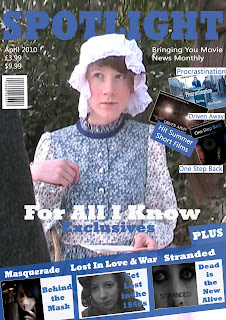
 Our poster doesn’t include any reviews or ratings and neither does our magazine cover because it is the cover of a magazine and short reviews aren’t a common code and convention of magazine front covers. But if we had our film reviewed we would have used someone like ---- because they reflect our target audience which is 12 +. Our film magazine cover also includes articles about Lost In Love and War, Stranded, Masquerade and short films Driven Away, One Step back and Procrastination. These articles all coincide with the films and movie magazines target audience and reflect our peers work. Also our film magazine cover shows the same female protagonist from the poster which will signify to the audience that it is the same film.
We had some trouble with having to re edit the magazine cover because of copyrighted photos used, all this is explained in my earlier post: http://g324meganridley.blogspot.com/2010/03/ancillary-texts-new-improved-magazine.html
No comments:
Post a Comment